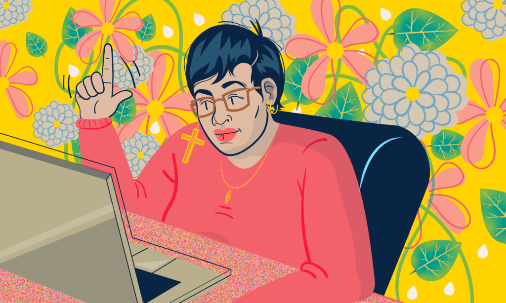
Taste: My Low-key Manifesto About Race and Class in the Design World
With musings on other things, and how bad design is good sometimes. By Justine Allenette Ross.
12-15 Minute Read
Since I’ve been at home a lot, I’ve had time to think about design, visual communication, and what it all means to me and the world surrounding me. How my identity affects my interaction with design and art. Let’s start at the beginning; I was born in Detroit in 1992. I spent my formative years in the city and my preteen and teen years in the burbs; Belleville Michigan, exciting stuff. As a kid, I always liked the draw. I would fill the end pages out in my books with little doodles and drawings. Upon further reflection, I probably should’ve asked for a sketchbook. I had nothing else I was remotely good that would make me any sort of money so going into the arts was a no-brainer for me. I’m not the only creative type in the family. My sister is a writer, and my brother is also a visual artist. In fact, my sister is getting her master’s in creative writing and part of the reason why my brother got promoted to this job because of his #aesthetic.
My father is an engineer at Ford and definitely behaves like one. He’s blunt, dry, and so straight-forward that it can get to the point of rudeness on occasion (sorry dad). He’s also an academic with a wonderful sense of curiosity. He’s always seeking knowledge, asking questions and he inhales the news likes nobody’s business. He has no sense of romance or whimsey, however, and his fashion sense is abysmal. If a movie doesn’t have explosions he can’t sit through it. Just no taste at all. I derive him for consistently wearing brown shoes with black socks. I always felt a bit bad for him, in the sense that he was surrounded by super artsy, sensitive people.
I’m quite inquisitive which helps my art in the long run, and I have him to thank for that. My siblings and I get our creative streak from our mother. She is the exact opposite of my father; she is a walking talking example of taste and style. I can’t go into public without some stranger complimenting her wardrobe. Honestly, it’s frustrating when she needs my help while grocery shopping I have to practically drag her out the store. As stated earlier, my mother is a creative being. So much so that when my mother was a teen she got to showcase a piece of her art at the DIA through a program that I don’t remember the name of. When she got married and had kids, she had to give that up somewhat. She used her talents in a more domestic sphere, by cooking and decorating and gardening, and hosting parties. Her garden in the springtime is legendary. To say that she has a green thumb is an understatement; she has the power to look at a pile of dirt and magically make flowers grow out of it. I took after in that department…kinda. I love flowers, however, I have the hardest time keeping them alive. RIP to my beautiful succulent, George.
“As a kid, I always liked the draw. I would fill the end pages out in my books with little doodles and drawings.”
My mother taught me presentation is key. Whether it be a dinner party, a killer outfit, or a garden, she’s will make a statement. If you make things look nice people will pay attention. She has a particular touch. Her teaching me that by example has ABSOLUTELY helped my career in the long run. My grandad is an artist, too. Mom gets it from him. Our house is full of his paintings. He and my mom both encouraged my creativity. To this day, when we go visit him I can count on him asking me if I need any more canvas. I have more canvas than I know what to do with. When I told my dad that I wanted to be an illustrator or designer he was concerned that I’d be selling t-shirts on Livernois. I don’t want to give the wrong impression, my father was supportive ( he still is ) but he has his concerns, and rightfully so. The arts aren’t known to be the most lucrative of professions unless you made it…or dead. Death is out of the question for me at the moment, so my only option is to “make it”. Whatever that means. At an art show in college, my father approached one of my old professors and asked her point-blank: “Is she gonna be able to get a job?” She affirmed that I could, and his worry was eased a bit.
I went to Henry Ford Community College, transferred to Wayne State University, and then I graduated. Yay me! College took me 6 and a half years to finish. That was in 2017. I was between jobs when Covid it, thanks to my family being so supportive, I was able to take the time and focus on illustration during my gap. When Covid hit I took the time to better my illustration skills. Right before Covid, I was in a group art show at KO Gallery. I was feeling kind of grown-up. Y’know? I get to put that I was showcased in a gallery on my ‘About Me’ page on my Squarespace. Thumbs Up. During Covid, I started selling art prints and have had my work featured in a couple of publications. Am I taking the world by storm with my genius? Not yet. Am I swimming in cash? Not yet, let me “make it” first. But I’m at a better place now than I was last year, emotionally at least. It’s been nice. So! Enough about me, let’s talk about this manifesto!
Design is communication
Fundamentally: design is communication. That means that even “bad design” is communication. I believe there’s a time and place for everything, even for “bad design” too. Hear me out. The certain aesthetic you see in “hole-in-the-wall restaurants” isn’t technically pleasing but it works in the context of the restaurant. For example, I’ve been frequenting a Mediterranean joint recently where you can get a gyro or shawarma for five bucks. They’re damn delicious. The menu could use some work though; It resembles something that the owner’s cousin put together after taking a semester of photoshop at the local community college. Don’t get me wrong, It’s not a bad looking menu. It gets the job done but it lacks refinement. And that makes it perfect. It’s absolutely perfect for what I’m ordering. If the menu was too flashy, too slick, too pristine, simply put, I wouldn’t trust the food. It would feel like it’s compensating for something, hiding something. Trying to impress me with aesthetics when I don’t want to be impressed with aesthetics, I want a chicken gyro with extra sauce and pickles and I want it for $5. Good looking menu equals bad food if I’m paying $7 for 13 pieces of grape leaves.
Design should still have rules, as all skills should. I’m not saying to throw out the grid system! What I am saying is that there shouldn’t be a default for design.
The idea I get from this unrefined menu? The overall message? “We’re too busy making delicious food to be concerned with the menu. There’s words and pictures. It’s fine. Can you read it? What do you want to order?” That is the message communicated by the decorative typeface that they clearly downloaded from Dafont, and that is fine. Design should still have rules, as all skills should. I’m not saying to throw out the grid system! What I am saying is that there shouldn’t be a default for design. If things are too designed, too purposeful, too calculated, it leads to BAD DESIGN. Remember the whole GAP fiasco? I do. Let’s delve into it.
In 2010 the GAP decided to update its logo. Instead of that beautiful elongated serifed wordmark the nation was used to, it got replaced with clip art. A san serifed, thick, wordmark with thrown on top for good measure. I kid you not, it looked like clip art. We, as a nation, was so rightfully horrified that they promptly switched it back (a very good call). I know why they updated the logo, we all do! They wanted to appeal to the contemporary landscape. There was a big meeting, someone in marketing looked up current design trends with focus groups all that jazz. The design team got to work and they came up with that clip art.
They did the work, all the rough steps, but it was still awful. Why was it so bad? Not only was it ugly, but it was unnecessary! It did not communicate GAP. The GAP is classic, a staple brand, old fashioned but reliable. The new identity logo did not portray that at all, so it was a failure. They wanted to look current, and by doing that they lost the identity of GAP. The logo communicated the wrong idea, therefore, it was bad design. That was the last time the gap rebranded. GAP learned the lesson that minimal does not always equal good the hard way. Swiss design does not always equal good design. General Motors is also learning this lesson. Just go google the logo. I don’t need to explain why it’s bad. Also, constantly rebranding is insecure isn’t it? As a company, what you trying to prove? A lot of hair care products I use are from the past, and I can tell because they clearly have not rebranded since 1967.
For example, Blue Magic is a hair oil that Black people use because Black people is naturally drier, so we have to add oil to avoid breakage. The label, the logo, the container haven’t changed since the ’90s at least. If the label changed all of a sudden? I would probably stop buying the product because I would assume they changed the formula or something. They might’ve changed the ingredients already but I’m none the wiser! By not updating the company is saying “We’re staying the same. Your grandma used this oil on her head. Trust us.” Could the brand identity use an update? Sure. Would it be detrimental to their brand and my trust in them as a consumer if they did? Absolutely. When I tell other visual creators – designers, illustrators, or art directors – of my concept of bad design sometimes being good design if it communicates a good idea I get one of two responses. One is “Gross, no. Eww…”. The second is “YOOO! I kinda feel that.”. Either way, I’m met with enthusiasm on the topic. This segways to my other point.
Your Cultures and identities influence your work without you even knowing it.
When you’re a “creative”, not only does the art that you see out influence you, but also the art that you grew up with. Black art inspires me. Not just high art like Kehinde Wiley and Michalene Thomas. They are geniuses, absolutely, but the art that has seeped into my system is the art that I see in beauty supplies stores, hair salons, in your aunties kitchen. The Annie Lee’s, the Ernie Barnes. The movement of the figures, the stories that you see. That’s what I find myself going back to the most often. By design being so classist sometimes, there are stories that aren’t being told. Certain colors and patterns aren’t being elevated. That little girl in the hair salon looking at the art on the wall while waiting to get her hair done has the potential to be a great creative director one day. But if she goes into her intro to design class and only sees work that doesn’t pertain to her experiences, will she have the confidence to pursue that? Will she feel “seen” enough to feel like she has “space” in this field? Will she feel as though her cultural taste is validated? Will you blame her if she won’t?
I’m very conscious that I am a Black creative; a Black woman. I want you to be aware of it too. I want, no, NEED you to know that I’m a Black woman. If you don’t see that in my art then I’m doing something wrong on my end. In fact, I somewhat forgot how to draw white people. I struggle on their noses. When I illustrate I’m conscious of how I portray Black people. I can’t control how the news portrays us, but I can control how I portray us. Recently I made an illustration of the Eastern Market. As a self-respecting millennial, I put it on all my social media channels. The Eastern Market caught wind of my illustration, to be fair I @‘ed them on my Twitter, so I um…tapped them on the shoulder, and they reposted the pics on their social media channels in kind! Which was dopeness! In the illustration, no one is obviously white. They’re racially ambiguous if you will, and should be read as black or of color.
To bring it back to my main point, the structure of the design world inadvertently invalidates POC’s and it needs to be reckoned with.
When it made it to Eastern Markets Instagram, some guy decided to shed his white tears at the lack of white people in the picture. Claiming that, and I’m paraphrasing “white people shop at the Eastern Market so they should be in the picture.” To be honest that comment was a bit of a downer for me. He would not have felt the need to say this to me if it was a picture full of white people. Seeing a picture full of POC’s in a space he deemed “white” angered him. When you are not white, cis, or male, someone is going to always invalidate your experience. In this case, a man was trying to invalidate my art. To bring it back to my main point, the structure of the design world inadvertently invalidates POC’s and it needs to be reckoned with. It needs to be talked about at a grander scale. Let’s have a conference about it! That Blue Magic is in me. It’s a part of my story.
That Blue Magic seeps out into me therefore it seeps into my work. It seeps into my design and I feel obligated to honor that. In college, I had the notion of what design was; clean, neat, straightforward, and Swiss. The problem was, I did not fit into any of those categories. I am not clean, or neat. I talk in circles and I’m definitely not Swiss. I didn’t go gaga over the grid system. Helvetica is chill I guess? But who says??? Who’s says Helvetia is the be-all and end-all of everything?? The white powers at be! As a consequence of this Eurocentric structure, I floated through college. In high school, I confidently told everyone that I was an aspiring illustrator. Things changed when I got to college though. I was trying to be less of an illustrator and more of a Swiss designer. It wasn’t working. I was trying to tone down my love of patterns, of color, of boldness, of loudness essentially. I thought that design was taken more seriously if it was starker, cleaner. More European. Less…me. Less female, less Black, less anything I found important or that was an integral part of my identity. I also struggled with the idea of illustration being taken less seriously compared to traditional design. I viewed design as regal. More respected. So I tried to put my illustrations on the back burner. The problem was…that I kept on illustrating anyways.
I’m a Black Woman AND I’m an Illustrator, DANGIT!
I couldn’t tone it down. My projects wouldn’t excite me unless I got to make them illustrative. For my final art show at the university, I didn’t even technically design anything. I drew a bunch of houses. Thanks to a couple of professors, shout out to Danielle and Stephen, I was finally able to come to Jesus about it… I’m a bloody illustrator who designs. Not vice versa. Illustration was me. I’m a Black illustrator. Even though I had this knowledge since AT LEAST 2016, I’m just now starting to realize what that means. My illustrations are their own entity, but they inform my design work. It took me too long to realize that not everyone is made for the grid system. The two were not mutually exclusive. Approaching my design work as illustrative work makes sense in my brain.
That’s how I communicate. ( I see the vise versa all the time and can tell when a graphic designer can also illustrate. ) Now, this was an extremely self-imposed limitation on my part. No one ever told me to tone myself down but I felt that I had to. I didn’t realize until I got out of college the lack of representation really affected my confidence in my work. I didn’t see myself in my textbooks. I didn’t have a Black person to look up to; I barely had female designers to look up to. Except for Paula Scher, who is a genius and a goddess. The big boys were Paul Rand, Milton Glaser, and the lot. Thanks to white supremacy and the patriarchy, those were the tastemakers. They’re gods. Late into my college career, I had to take a History of Design course with Danielle Aubert. If you don’t remember I shouted her out a few paragraphs ago (She’s a boss too, she was very adamant about exposing us to a diverse group of designers and design thinking. So thank you for that Danielle). There, I was reintroduced to Emory Douglas thanks to a research paper I had to do for the class. I knew of him but I didn’t fully explore him until then. He was the creative force behind the aesthetic of the Black Panther Party. He was their art director. Out of the list of designers I could’ve picked, I chose him out of my slight familiarity with him.
No one ever told me to tone myself down but I felt that I had to. I didn’t realize until I got out of college the lack of representation really affected my confidence in my work.
When I drew his name Danielle told me “I was hoping you would pick him to do your paper on.” I’m glad I did. His work was not clean, neat, straightforward, or Swiss. It was bold, powerful, conformational, and Black. At that time I also discovered Corita Kent, who was a nun and designer during the mid-century, was around when the big boys were afoot. However, she doesn’t get nearly as much shine compared to her contemporaries. Her work was not clean, neat, straightforward, or Swiss. Corita’s work is bright, feminine, playful, and American. It’s optimistic! I wish I would’ve had role models early in my college career. I think I would’ve been more comfortable being myself. Don’t get me wrong! Milton Glaser is a genius! I have a book of all his posters next to my bed as we speak. But the system was set up for him, not against him. Milton Glaser’s tastes were the TASTE. His aesthetic is deemed acceptable because he was a white guy. Plain and simple. I can acknowledge his genius while also acknowledging that the system was easier for him because he was the system.
See Me. See Us. Utilize Us.
Black Lives Matter got me thinking: it should be applied to more than just police brutality. It should affect all facets of life. Question everything. How come my textbook only shows one kind of design. It should permeate all aspects of life. It’s about being validated, about being seen. About being known. Black Lives Matter at work. Black Lives Matter in institutions. Black Lives Matter in design. Black Lives Matter in math. Black Lives Matter Everywhere. Throughout college, I was stifling my blackness from seeping into my art and I regret it. Black creativity, female creativity, queer creativity, Latino and Arab creativity; all vital for keeping design fresh, relevant. Touchable! Attainable! When people feel seen, they’re more prone to engage. And when more people engage, you have a more diverse pool to draw from. And more diverse stories lead to better art. Which leads to more than old white guys in your textbooks. I need to wrap this up! I’ve been going on for way too long. Long story short, we need to re-evaluate how we approach taste, whiteness, and who is getting left behind in the design world. Bad design is good design if presented under certain concepts and communicates the right idea. White isn’t right. It’s time to end that way of thinking. Look beyond what the powers at be feed you and challenge everything. PS. Support your local shawarma place. I guarantee you it’s probably delicious.